Table of Contents
White Label User Guide
This document serves as a user guide for the White Label and Admin-user interface of the
Simply Be Found Marketing Platform.
How to Log in to the Platform
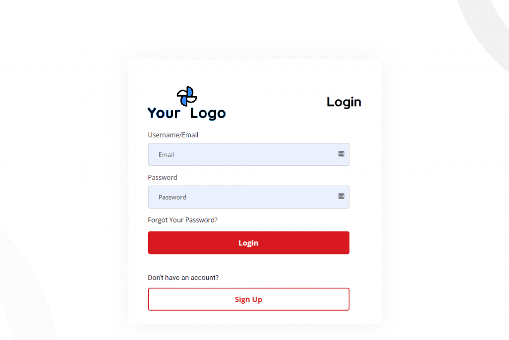
Open your browser and in the URL box, type in the URL that was setup for your login and press enter.
The login page will load on your screen. Please fill in the boxes with your registered email address and password.
White Label
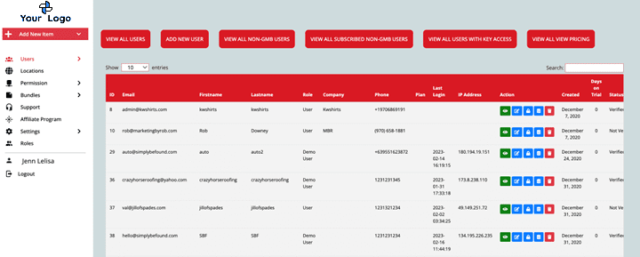
Once you are logged in, the page that will populate is your Dashboard. It would look like the image below. This is your Admin home page.
Sections of White Labelling
- Site Identity
- Support Email
- Sign Up button URL
- Back Button Link
- Terms and Services Link
- Sign Up button Appearance
- Back button Appearance
- Appearance
- External billing
- Stripe Settings
- Product Settings
- Mail Server settings
- GMB Connection Credentials
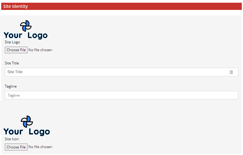
Site Identity
The Site Identity is where you will upload the Site Logo and Site Icon. Then, input the Site Title, and Tagline.
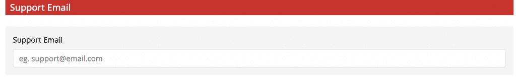
Support Email
Support Email section is the field where you can add your support email should you have your own support email system.
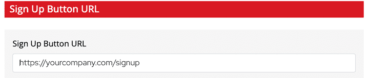
Sign Up Button URL
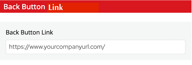
Back button Link
This field is where you put the link and direct them to the page should they click the back button.
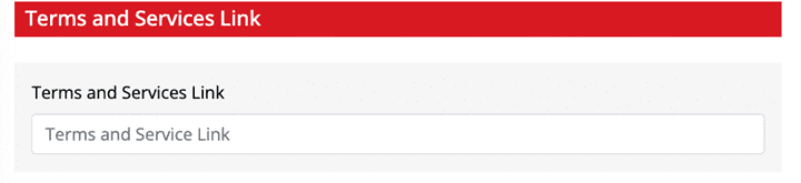
Terms and Services Link
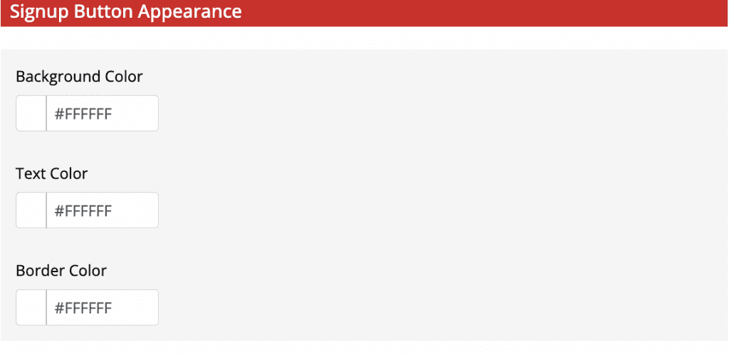
Signup Button Appearance
In the Signup button appearance section, you may set your brand colors and add the following specifications to your brand appearance:
- Background Color
- Text Color
- Border Color
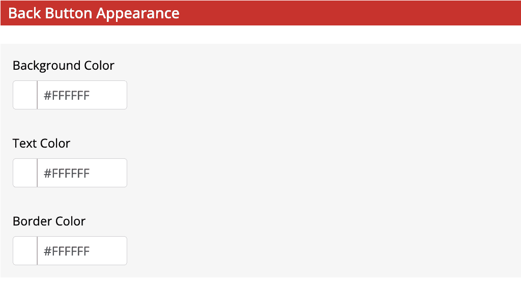
Back Button Appearance
You may also set your brand colors for the back button with the following specifications:
- Background Color
- Text Color
- Border Color
Appearance
In the appearance section, you may set your brand colors. You may add the following specifications to your brand appearance:
- Primary Color
- Secondary Color
- Accent Color
- Header Background Color
- Footer Background Color
- Footer Text Color
- Sidebar Background Color
- Sidebar Menu Text Color
- Sidebar Link Background Color
- Sidebar Link Hover Background Color
- Sidebar Hover Text Color
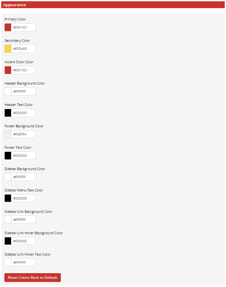
At the bottom of this section, there is a button to “Reset Colors Back to Defaults” in case you want to start from scratch on the branding colors.
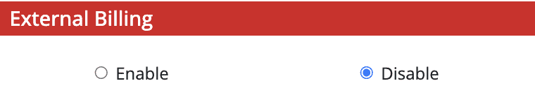
External Billing
This section gives you the option to enable and disable billing.
Stripe Settings
To link and set up your Stripe Account to the platform, fill in the required information on the Stripe Settings form.
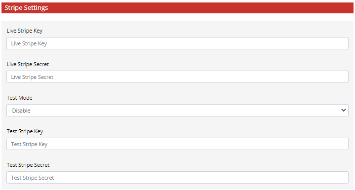
The following information is needed:
- Live Stripe Key
- Live Stripe Secret
- Test Mode Dropdown – To enable or disable
- Test Stripe Key
- Test Stripe Secret
Product Settings
On the Products Settings section, you may add your product information.
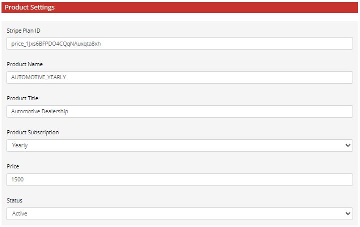
Fill in the following information in their respective text boxes:
- Stripe Plan ID
- Product Name
- Product Title
- Product Subscription – Choose if it is Monthly or Yearly Plan
- Price
- Status – Set if it is Active or Inactive
Mail Server Settings
To link and set up your own mail server, fill in the required information on the Mail Server Settings form.
The following information is needed:
- From Name
- From Address
- Protocol
- Host
- Port Number
- User Name
- Password
Double check your entries to make sure they are correct. After all the sections have been filled and completed, select the “Submit” button at the bottom of the page to save your entries.
Your White Label Settings will then reflect on the platform.
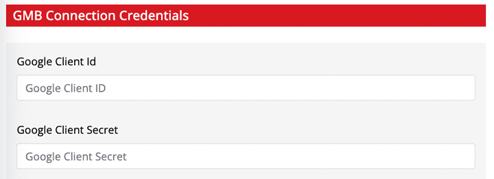
GMB Connection Credentials
Admin Dashboard / All Users Page
Once you are logged in, the page that will populate is your Dashboard. It would look like the image below. This is your Admin home page.
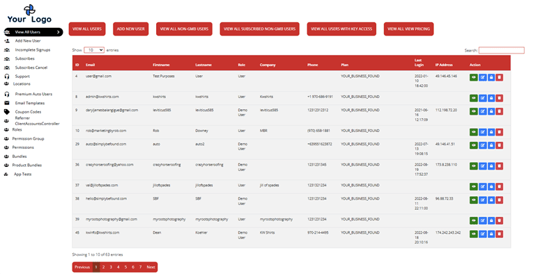
Your main dashboard is the view of all the users registered under your admin account, it will have the list of the users and the following buttons that serves as the page filter at the top:
- View All Users
- Add New User
- View All Non-GMB User
- View All Subscribed Non-GMB User
- View All Users with Key Access
- View All View Pricing
View All Users Page Buttons
Below are the buttons that are on the “View All Users” page.
View All Users Button
When the “View All Users” button is selected, the page loads to the same main view when you first accessed it.
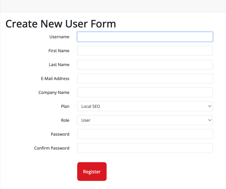
Add New User Button
When the “Add New User” button is selected, it will load the page to “Create New User” Form. It would look like the example image below.
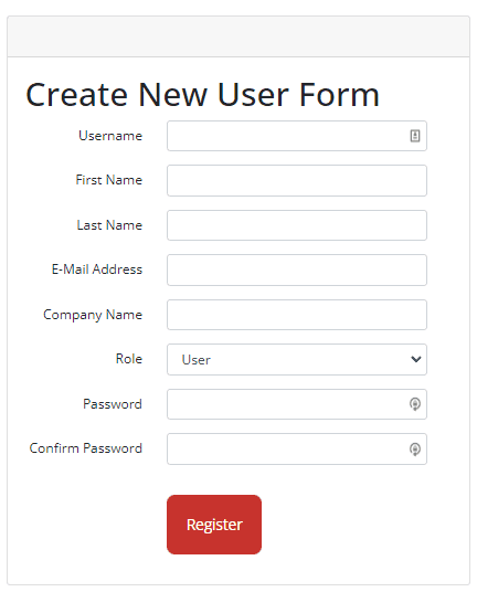
To create a new user, the form must be filled in with the following information:
- Username – assign a username to this new user
- First Name – Input the new user’s first name
- Last Name – Input the new user’s last name
- Email Address – Input the new user’s email address
- Company Name – Input the new user’s company name
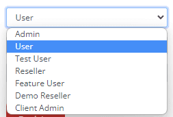
- Role – Choose the proper role for the new user from the dropdown menu
- Bundle – Assign which Bundle that locations for that user will default too.
- Password – Assign a password for the new user
- Confirm Password – Re-type and confirm the new user’s password.
Once all the text boxes have been filled in, select “Register” to save your input and create a new user.
View All Non-GMB User
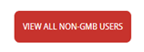
When the “View All Non-GMB Users” button is selected, it will load a list of users whose assigned locations/business is not registered or members of Google My Business.
View All Subscribed Non-GMB User
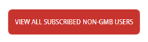
When the “View All Subscribed Non-GMB Users” button is selected, it will list of users whose assigned locations/business that are your members, but not registered or members of Google My Business.
View All Users with Key Access
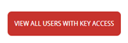
When the “View All Users with Key Access” button is selected, it will load a list of users that has key access.
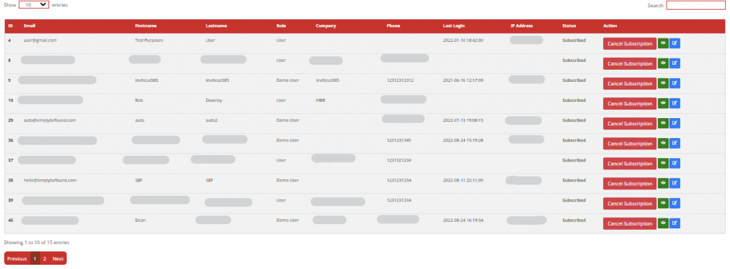
View All Users List and Details
When the “View All Users with Key Access” button is selected, it will load a list of users that has key access.

The user’s list shows the following information of the user:
- ID Number
- Email – Email address used to register
- First Name – User’s first name
- Last Name – User’s last name
- Role – User role as defined when they were registered
- Company – Company that the user is affiliated to or assigned to
- Phone – Registered number of the user
- Plan – The current subscription plan of the user
- Last Login – Time when the user last logged in
- IP Address – To keep track and secure the account
- Actions – Actionable buttons
View All Users Actionable Icons/Buttons
These buttons are at the final column of the User’s list.
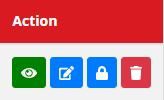
View Icon
These buttons are at the final column of the User’s list.
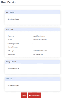
When the “View” icon is clicked, it will load the user details.
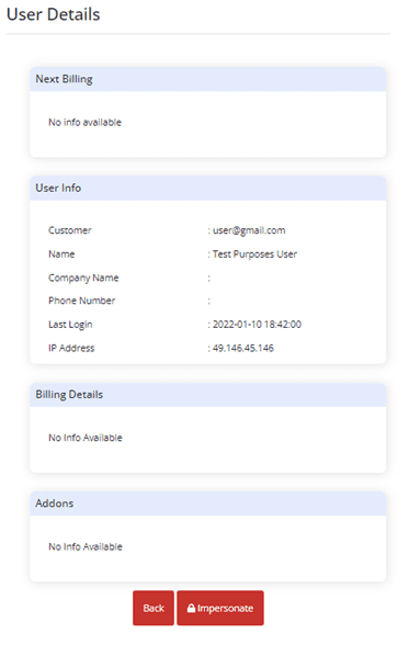
The User Details will show the Next Billing, User Information, Billing Details and Addons.
There are two buttons in the User Details “Back” and “Impersonate”.
Back button
When you click the back button, the page will load back to the main View All Users view.
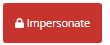
Impersonate
When you click the Impersonate button, it will load to the single-user platform that is linked to a specific business/location. This means you will be able to view all the information, scheduled items, media gallery, media posts etc., on the single-user platform of that specific location.
Edit Icon
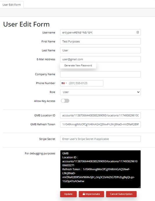
When the “Edit” icon is clicked, the page will load to the “User Edit Form”.
From this page you can update the following user information:
- Username
- First Name
- Last Name
- Email address
- Company Name
- Phone Number
- Role
- Allow Key Access
- GMB Location ID
- GMB Refresh Token
- Stripe Secret
- Information for Debugging Purposes
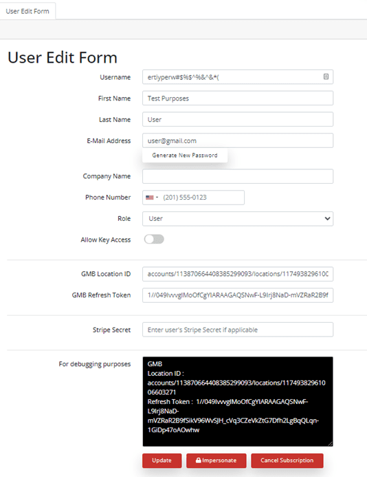
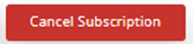
There are three buttons in the User Edit Form “Update”, “Impersonate” and “Cancel Subscription”.
Update button
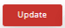
If you want to update the user information, input the changes to the form and click the “Update” to save the changes.
Impersonate Button
When you click the Impersonate button, it will load to the single-user platform that is linked to a specific business/location. This means you will be able to view all the information, scheduled items, media gallery, media posts etc., on the single-user platform of that specific location.
Cancel Subscription Button
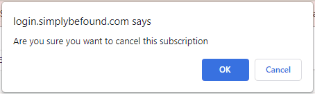
When you click the “Cancel Subscription” button, a confirmation prompt will pop-up at the top of the page. It would look like the example image below. This is a second step verification just in case the cancel subscription button is selected accidentally.
Lock Icon
When you click on the Lock Icon it will “Impersonate” it will load to the single-user platform that is linked to a specific business/location. This means you will be able to view all the information, scheduled items, media gallery, media posts, etc., on the single-user platform of that specific location.
To exit the impersonate view, select the “Exit” button at the top of the page. It will load back to the main “View All Users” Page.
Trash Icon

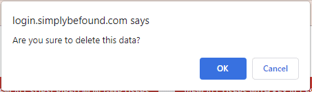
When you click on the “Trash” icon, a confirmation prompt will pop-up at the top of the page. It would look like the example image below. This is a second step verification just in case the trash icon button is selected accidentally.
To exit the impersonate view, select the “Exit” button at the top of the page. It will load back to the main “View All Users” Page.
Add New User

To create a new user, the form must be filled in with the following information:
- Username – assign a username to this new user
- First Name – Input the new user’s first name
- Last Name – Input the new user’s last name
- Email Address – Input the new user’s email address
- Company Name – Input the new user’s company name
- Role – Choose the proper role for the new user from the dropdown menu
- Password – Assign a password for the new user
- Confirm Password – Re-type and confirm the new user’s password
Once all the text boxes have been filled in, select “Register” to save your input and create a new user.
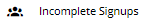
Incomplete Signups
On the left side panel, select “Incomplete Signups”. This will immediately load the Incomplete signups list on your screen. It would look like the example image below.
Incomplete Signups List and Details
Incomplete signups list will display the following information:
- ID Number
- First Name
- Last Name
- Role
- Company
- Phone
- Date Sign Up
- Actions Button
Incomplete Signups Actionable Buttons
These buttons are at the final column of the Incomplete Signup’s list.
View Icon
When the “View” icon is clicked, it will load the user details.
The User Details will show the Next Billing, User Information, Billing Details and Addons.
There are two buttons in the User Details “Back” and “Impersonate”.
Back button
When you click the back button, the page will load back to the main View All Users view.
Impersonate Button
When you click the Impersonate button, it will load to the single-user platform that is linked to a specific business/location. This means you will be able to view all the information, scheduled items, media gallery, media posts etc., on the single-user platform of that specific location.
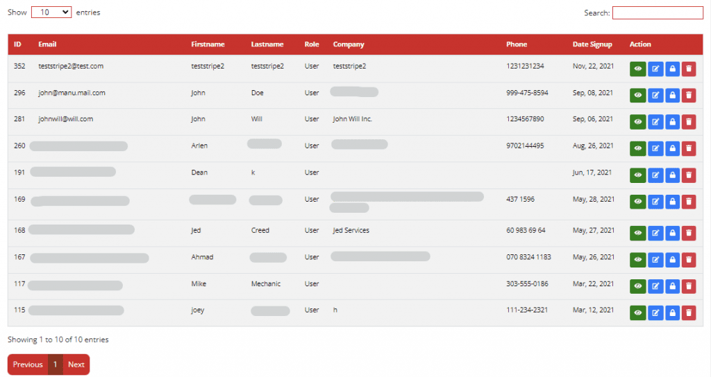
Edit Icon
When the “Edit” icon is clicked, the page will load to the page that has three tabs namely, “User Edit Form”, “Business Information” and “Business Hours”.
User Edit Form Tab
When the User Edit Form tab is selected, you will see the same image as below.
From this tab you can update the following user information:
- Username
- First Name
- Last Name
- Email address
- Company Name
- Phone Number
- Role
- Allow Key Access
There are two buttons in the User Edit Form “Update” and “Impersonate”.
Update button
If you want to update the user information, input the changes to the form and click the “Update” to save the changes.
Impersonate Button
When you click the Impersonate button, it will load to the single-user platform that is linked to a specific business/location. This means you will be able to view all the information, scheduled items, media gallery, media posts, etc., on the single-user platform of that specific location.
Lock Icon
When you click on the Lock Icon it will “Impersonate” it will load to the single-user platform that is linked to a specific business/location. This means you will be able to view all the information, scheduled items, media gallery, media posts, etc., on the single-user platform of that specific location.
To exit the impersonate view, select the “Exit” button at the top of the page. It will load back to the main “View All Users” Page.
Trash Icon
When you click on the “Trash” icon, a confirmation prompt will pop-up at the top of the page. It would look like the example image below. This is a second step verification just in case the trash icon button is selected accidentally.

To exit the impersonate view, select the “Exit” button at the top of the page. It will load back to the main “View All Users” Page.
Subscribes
On the left side panel, select “Subscribes”. This will immediately load the Subscribers to Email list on your screen. It would look like the example image below.
These are all the subscribed users.
Subscribes List and Details
From this page the following subscriber’s information is displayed:
- ID Number
- Email Address
- First Name
- Last Name
- Role
- Company
- Phone
- Last Login
- IP Address
- Status
- Actionable Buttons Column
Subscribes Actionable Button
Cancel Subscription Button
When you click the “Cancel Subscription” button, a confirmation prompt will pop-up at the top of the page. It would look like the example image below. This is a second step verification just in case the cancel subscription button is selected accidentally.

View Icon
When the “View” icon is clicked, it will load the user details.
The User Details will show the Next Billing, User Information, Billing Details and Addons.
There are two buttons in the User Details “Back” and “Impersonate”.
Back button
When you click the back button, the page will load back to the main View All Users view.
Impersonate Button
When you click the Impersonate button, it will load to the single-user platform that is linked to a specific business/location. This means you will be able to view all the information, scheduled items, media gallery, media posts etc., on the single-user platform of that specific location.
Edit Icon
When the “Edit” icon is clicked, the page will load to the “User Edit Form”.
From this page you can update the following user information:
- Username
- First Name
- Last Name
- Email address
- Company Name
- Phone Number
- Role
- Allow Key Access
- GMB Location ID
- GMB Refresh Token
- Stripe Secret
- Information for Debugging Purposes
There are three buttons in the User Edit Form “Update”, “Impersonate” and “Cancel Subscription”.
Update button
If you want to update the user information, input the changes to the form and click the “Update” to save the changes.
Impersonate Button
When you click the Impersonate button, it will load to the single-user platform that is linked to a specific business/location. This means you will be able to view all the information, scheduled items, media gallery, media posts etc., on the single-user platform of that specific location.
Cancel Subscription Button
When you click the “Cancel Subscription” button, a confirmation prompt will pop-up at the top of the page. It would look like the example image below. This is a second step verification just in case the cancel subscription button is selected accidentally.
Subscribes Cancel
On the left side panel, select “Subscribes Cancel”. This will display the list of those who has canceled their email subscription. Please note Subscribers who canceled can be resubscribed via the “Resume Subscription” button all the way to the right. It would look like the example image below.
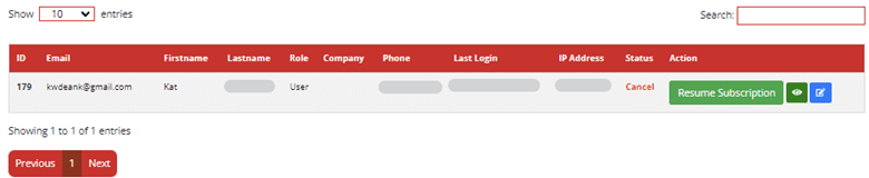
Subscribes Cancel List and Details
From this page the following subscriber’s information is displayed:
- ID Number
- Email Address
- First Name
- Last Name
- Role
- Company
- Phone
- Last Login
- IP Address
- Status
- Actionable Buttons Column
Subscribes Cancel Actionable Buttons
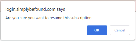
Resume Subscription Buttton
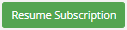
When you click the “Resume Subscription” button, a confirmation prompt will pop-up at the top of the page. It would look like the example image below. This is a second step verification just in case the Resume subscription button is selected accidentally.
View Icon
When the “View” icon is clicked, it will load the user details.

The User Details will show the Next Billing, User Information, Billing Details and Addons.
There are two buttons in the User Details “Back” and “Impersonate”.
Business Info Tab
When the Business Info Tab is selected, you will see the same image as below.
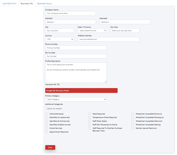
From this tab you can update the following user information:
- Company Name
- Complete Address of the Business/Location
- Phone Number
- Fax Number
- Profile Description
- Google My Business Fields – from the dropdown select the business category and then you may select an additional category from the list of tick boxes provided as well.
- Once you are done inputting the update, select the “Save” button to save changes.
Business Hours Tab
When the Business Hours Tab is selected, you will see the same image as below.
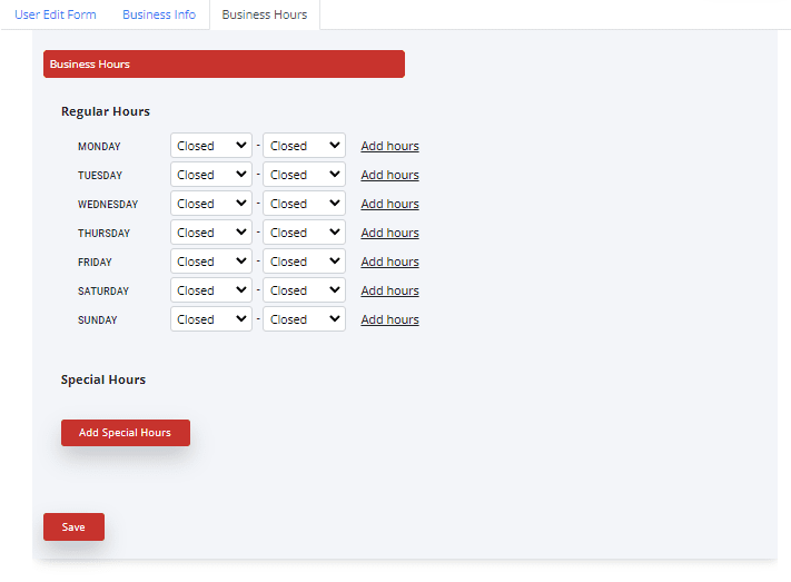
From this page, you may update the Business Hours of the location and Add Special Hours. This feature is particularly helpful when the business is celebrating an occasion or during holidays. It would help the customers understand your operating hours on specific days and occasions.
Once you are done updating the Regular Hours or adding Special Hours, click the “Save” button to save the changes.
Back button
When you click the back button, the page will load back to the main View All Users view.
Impersonate Button
When you click the Impersonate button, it will load to the single-user platform that is linked to a specific business/location. This means you will be able to view all the information, scheduled items, media gallery, media posts etc., on the single-user platform of that specific location.
Edit Icon
When the “Edit” icon is clicked, the page will load to the page that has three tabs namely, “User Edit Form”, “Business Information” and “Business Hours”.
User Edit Form Tab
When the User Edit Form tab is selected, you will see the same image as below.
From this tab you can update the following user information:
- Username
- First Name
- Last Name
- Email address
- Company Name
- Phone Number
- Role
- Allow Key Access
There are two buttons in the User Edit Form “Update” and “Impersonate”.
Update button
If you want to update the user information, input the changes to the form and click the “Update” to save the changes.
Impersonate Button
When you click the Impersonate button, it will load to the single-user platform that is linked to a specific business/location. This means you will be able to view all the information, scheduled items, media gallery, media posts, etc., on the single-user platform of that specific location.
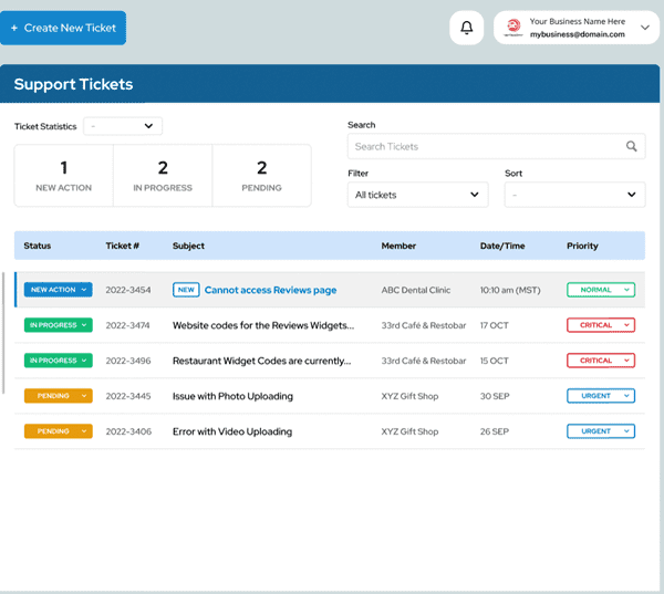
Support
On the left side panel, select “Support”. This will display all the tickets recorded from all locations associated with the Admin User. It would look like the example image below.
Filtering and Sorting
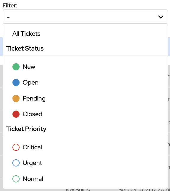
Filtering
These are the options to filter the tickets by Ticket status or Ticket Priority:
- All Tickets
By Ticket status
- New
- Open
- Pending
- Closed
By Ticket Priority
- Critical
- Urgent
- Normal
Sorting
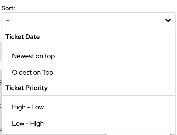
There are 4 options to sort the tickets:
- Newest on Top
- Oldest on Top
- High – Low
- Low – High
Support Ticket List and Details
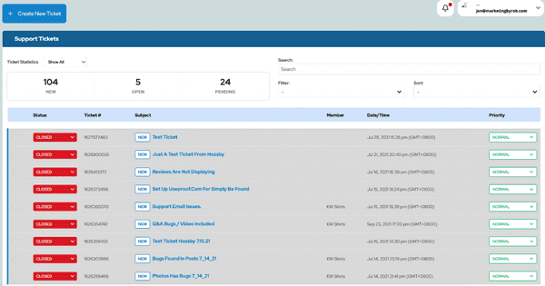
The Support Ticket List shows all the Tickets created from all locations associated with the Admin User whether its status is New Action, In Progress, Pending and Closed. Each ticket has a preview on the Ticket list. It shows the following information:
- Ticket subject/Ticket topic
- Ticket Number for reference
- The location
- Ticket Status – whether it is New, In Progress, Pending and Closed.
- Date of Creation
- Priority
Viewing the Tickets
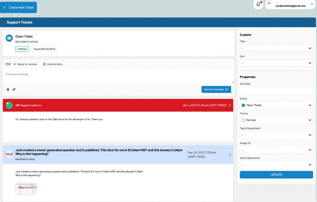
To view the ticket, select the ticket you want to view from the main Tickets List, and it will load the view of the tickets. As shown in the image above, The Tickets will display the conversation between the user and your support representative happens.
On the pane, you can see the following information:
- Ticket Subject/Topic
- Ticket Number
- Ticket Status
- Ticket Creation Date and Time
- Priority
- The message exchange from the beginning to the most recent
- Option to add/upload an attachment to provide more information
- Text box
- Filter dropdown
- Sort dropdown
- Due Date field
- Status option
- Priority option
- Tag a department
- Assign to option
- Add collaborators option
- Update button
You may respond or send message to the Support team by typing your message in the textbox and then clicking on the send button or “Enter” key on your keyboard. Also, you may add attachments by clicking on “Upload Attachment” to the left of this field.
Locations
On the left side panel, select “Locations”. This will display all the locations associated and managed by the admin account/user. It would look like the example image below.
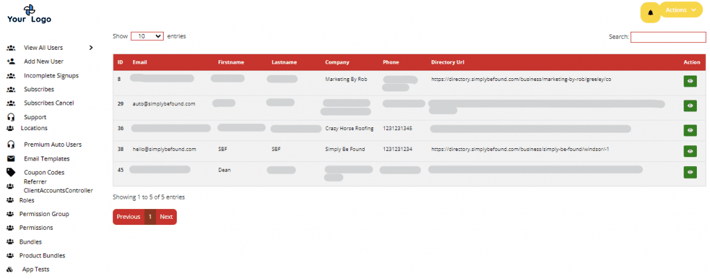
Locations List and Details
Locations List and Details
From this page the following subscriber’s information is displayed:
- ID Number
- Email Address
- First Name
- Last Name
- Company
- Phone
- Directory URL
- Actionable Buttons Column
Locations Actionable Button
View Icon
When the “View” icon is clicked, it will load the user details.
“Info” will be displayed that shows the location’s details, and their marketing activity below.
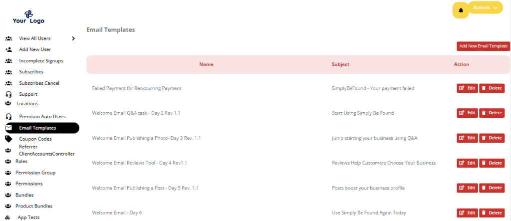
On the left side panel, select “Email Templates”. This will display all the Email Templates. On the upper right side of the page, is the “Add New Email Template” button. The page would look like the example image below.
Creating A New Email Template
Click on “Add New Email Template” on the upper right of the page. The Create New Email Template Form Fields will load like the example image below.
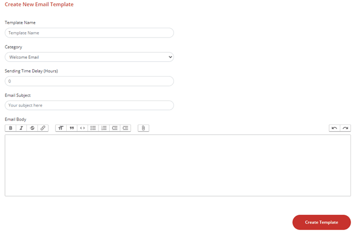
To create an email template, fill in the form field with the following information:
- Template Name – Create a name for your email template (This is only visible to you)
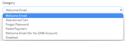
- Category – Choose from dropdown of email categories as shown in the image below
- Sending Time Delay (hours)
- Email Subject – This will be the email subject that is visible to the receiver)
- Email Body – Write up your email body with formatting and attachment as you would do on a normal email.
When finished, click on the “Create Template” button at the bottom of the form.
Email Templates List and Details
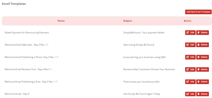
From this page the following information is displayed:
- Template Name
- Subject
- Actionable Buttons Column
Email Templates Actionable Buttons
Edit Button
When the “Edit” button is selected, the Email Template Form page will load with the current information of that Email Template. In the example below, we used the Email Template for Failed Payment for Reoccurring Payment.
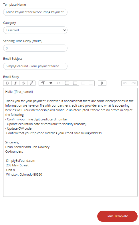
- From here, you may update the email template, once done, select the “Save Template” button at the bottom of the page to save the changes.
Delete Button
When the “Delete” button is selected, the Email Template will automatically be deleted.
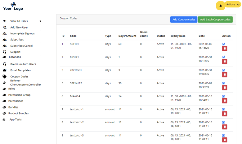
Coupon Codes
Adding Coupon Codes
To add a coupon code, select the “Add Coupon Codes” button at the upper right corner of the page. Once selected, it will load the “Create Coupon Code” form like the example image below.
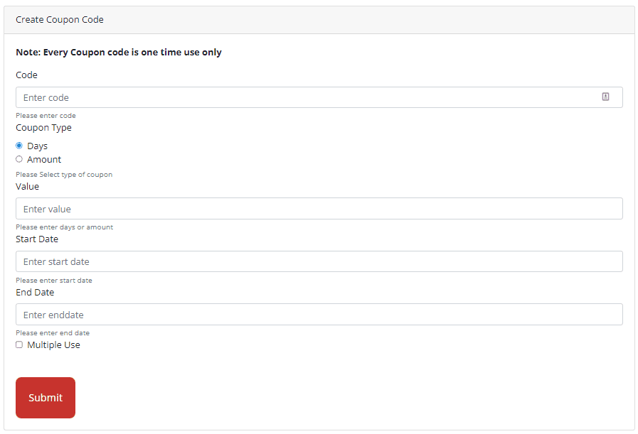
Fill in the Create Coupon Code with the following information:
- Code – Your preferred code name
- Coupon Type – It can be a days or amount type of coupon
- Value – Input the numerical value of the coupon
- Start Date – Input the date the coupon will go live
- End Date – Input the date the coupon will expire
- Multiple Use – tick this box to format the code for multiple use.
Once all information has been filled, select the “Submit” button. The code will then reflect and show on the main Coupon Codes Page.
Add Batch Coupon Codes
To add batch coupon codes, select the “Add batch coupon codes” button at the upper right corner of the page. Once selected, it will load the “Create Coupon Code” form like the example image below.
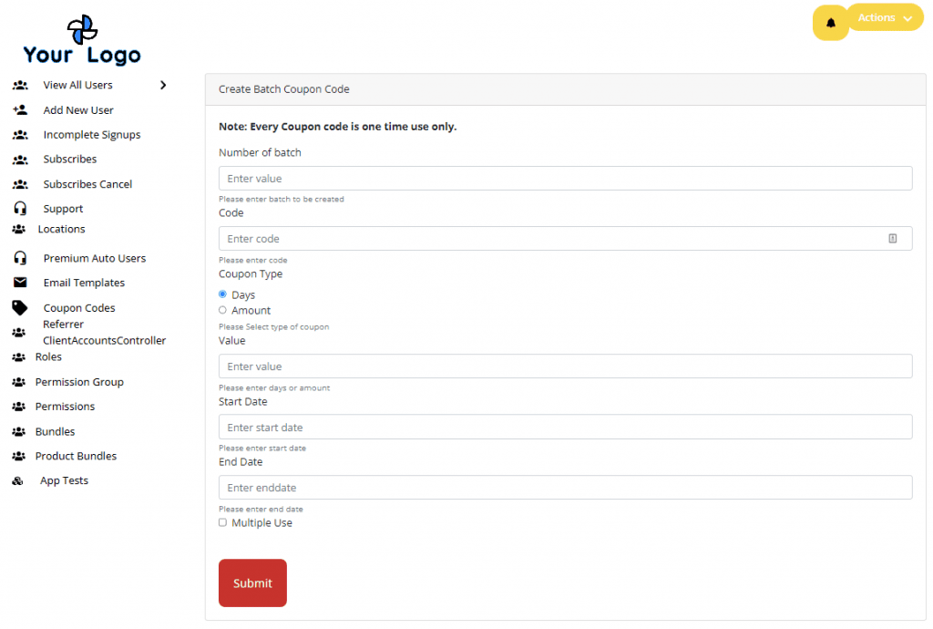
Fill in the Create Coupon Code with the following information:
- Number of Batch
- Code – Your preferred code name
- Coupon Type – It can be a days or amount type of coupon
- Value – Input the numerical value of the coupon
- Start Date – Input the date the coupon will go live
- End Date – Input the date the coupon will expire
- Multiple Use – tick this box to format the code for multiple use.
Once all information has been filled, select the “Submit” button. The code will then reflect and show on the main Coupon Codes Page.
Coupon Codes List and Details

The Coupon Codes list displays the following information:
- ID Number
- Code Name
- Type
- Days/Amount
- Users Count – Number of times the code has been used
- Status – Active or Inactive
- Expiry Date
- Date
- Actionable Buttons
Coupon Codes Actionable Buttons
Edit Button

When the “Edit” icon was selected, it will load to the “Update Coupon Code” form page. See the example image below.
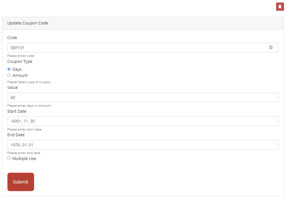
From here, you may choose to update the following information:
- Code – Your preferred code name
- Coupon Type – It can be a days or amount type of coupon
- Value – Input the numerical value of the coupon
- Start Date – Input the date the coupon will go live
- End Date – Input the date the coupon will expire
- Multiple Use – tick this box to format the code for multiple use.
Once all information has been filled, select the “Submit” button. The changes will then reflect and show on the main Coupon Codes Page. You may also permanently delete this coupon on this page by selecting the delete icon on the top right of the form.
Delete Button
When the “Delete” icon was selected, a pop-up like the image below will appear.
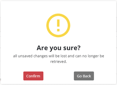
This will ensure that no coupon code will be deleted accidentally in a single click.
Referrer Client Accounts Controller
On the left side panel, select “Coupon Codes”. This will display all the Coupon Codes set for all the locations associated with the admin account/user. On the upper right side of the page, is the “Add Coupon Codes” and “Add Batch Coupon Codes” button. The page would look like the example image below.
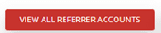
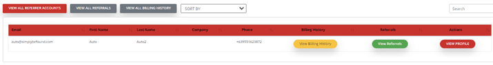
There are 3 Buttons at the top left of the page, namely:
- View All Referrer Accounts
- View All Referrals
- View All Billing History
Referrer Buttons
View All Referrer Accounts
When this button is clicked, the page will load back to the main Referrer Clients Account Controller page. It will display all the referrer accounts that the admin user has. Its list details would have the same column titles as the example image below.
View All Referrals
When this button is clicked, the page with the list of all referrals will be displayed. Its list details would have the same column titles as the example image below.
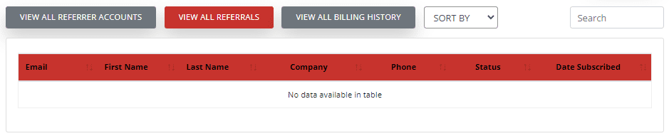
The referrals list will preview the following information:
- First Name
- Last Name
- Company
- Phone
- Status
- Date Subscribed
View All Billing History
When this button is clicked, the page will load to the list of billing history. Its list details would have the same column titles as the example image below.
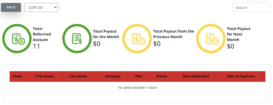
There will be 4 indicator summaries at the top of the page namely:
- Total Referred Account
- Total Payout for the Month
- Total Payout from the Previous Month
- Total Payout for Next Month
Billing History Sorting
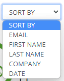
The billing history list can be sorted by the following options shown in the dropdown image below.
Billing History List and Details
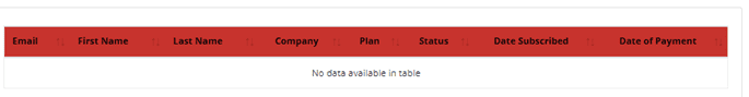
The billing history list will preview the following information:
- First Name
- Last Name
- Company
- Plan
- Status
- Date Subscribed
- Date of Payment
To go back to the main page, select the “Back” button beside the Sort dropdown at the top of the page.
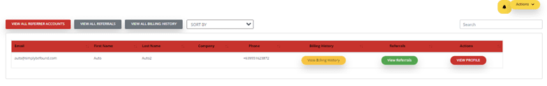
Referrer Client Accounts Controller List and Details
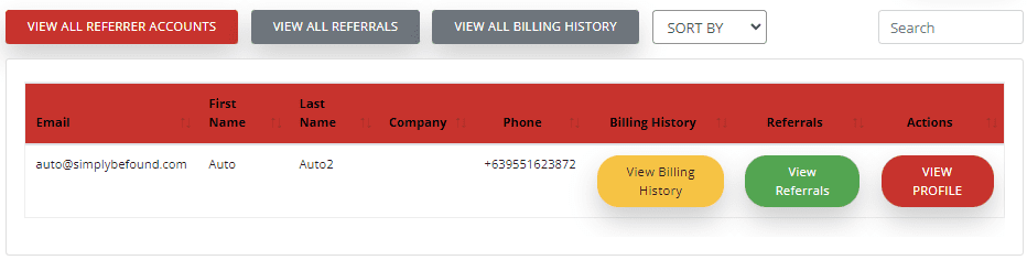
From this page the following information is displayed:
- First Name
- Last Name
- Company
- Phone
- Billing History
- Referrals
- Actions
Referrer Client Accounts Controller Actionable Buttons
View Billing History Button

When the view billing history button is selected, it will load the billing summary and history of the Referrer Client. It would look like the image below.
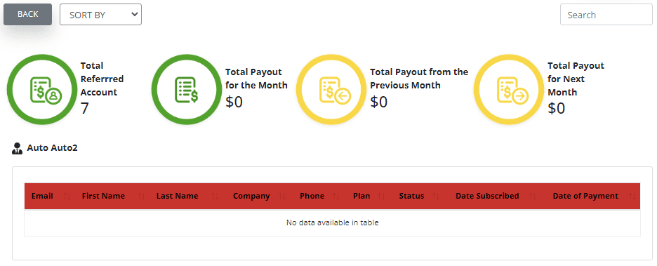
There will be 4 indicator summaries at the top of the page namely:
- Total Referred Account
- Total Payout for the Month
- Total Payout from the Previous Month
- Total Payout for Next Month
View Referrals Button

When the View Referrals button is selected, it will load the list of the referred users by this specifier referrer.
View Profile Button

When the view profile button is selected, it will load the referrer user details page. It would look like the image below.
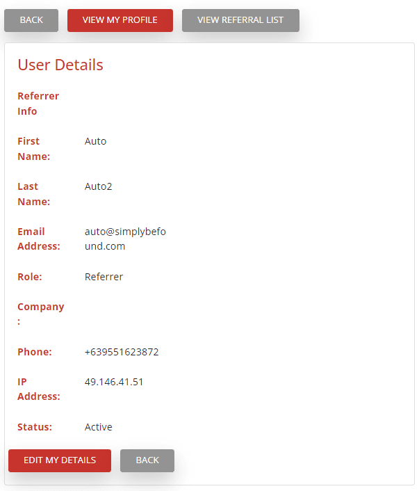
The user details will display the following information:
- Referrer info
- First Name
Last Name - Email Address
- Role
- Company
- Phone
- IP Address
- Status
Edit My Details and Back Button
At the bottom of View Profile user details, you will find the Edit my Details button. Select this button if you want to edit the user details. If you want to go back to the main Referred Controller page, select Back.
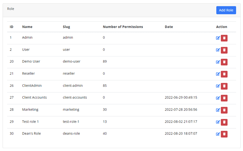
Roles
A role is a collection of permissions defined for the whole system that you can assign to specific users in specific contexts. On the left side panel, select “Roles”. This will display all the Roles created or set by the admin user. On the upper right side of the page, is the “Add Role” button. The page would look like the example image below.
Add a Role
To add a Role, select the “Add Role” button at the top of the Roles Page. This will load the Create Role and Permissions and Locations Permissions Page where you can select the permissions and access of the new role. can be specified for a certain role.
Create Role and Permissions
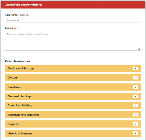
In this section, fill in the Role Name and Description boxes. Once done, go ahead and select the Roles Permissions. There will be 8 drop-down options to select the role permissions for managing a certain feature, they are as follows:
- Dashboard Settings
- Groups
- Locations
- Network Settings
- Plans and Pricing
- Referrals and Affiliate
- Reports
- User and Member
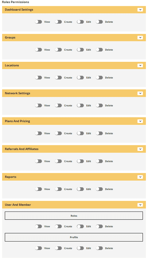
As shown in the image above, each Role Permissions drop down has 4 buttons to turn on and off:
- View – When turned on, it means this role can view this specific feature.
- Create – When turned on, this role can create in this specific feature.
- Edit – When turned on, this role can edit and modify in this specific feature.
- Delete – When turned on, this role can delete and modify in this specific feature.
Locations Permissions
In this section, you may select locations permissions for specific features for the Google Business Profile management. Once done, go ahead and select the Roles Permissions. There will be 10 drop-down options to select the locations permissions for managing certain feature, they are as follows:
- Business Hours
- Business Information
- Events
- Leads CRM
- Offers Coupons
- Photos
- Posts
- Questions and Answers
- Restaurant Menus
- Reviews
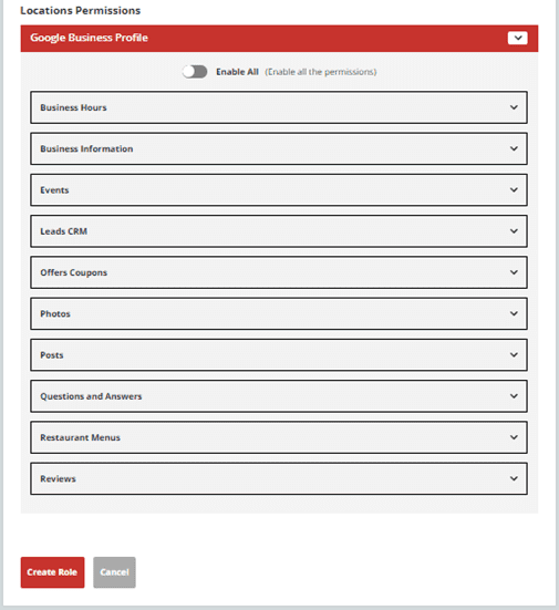
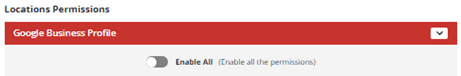
As shown in the image above, enabling all the permissions can be done quickly by turning on the “Enable All” switch button. On the other hand, if only specific permissions will be assigned to this role, customizing each item of locations permissions is preferred.
It is also something to note that the buttons in each feature listed in Locations Permissions varies.
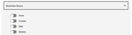
For Business Hours Locations Permissions below are the buttons that can be specified:
- View – When turned on, it means this role can view this specific feature.
- Create – When turned on, this role can create in this specific feature.
- Edit – When turned on, this role can edit and modify in this specific feature.
- Delete – When turned on, this role can delete and modify in this specific feature.
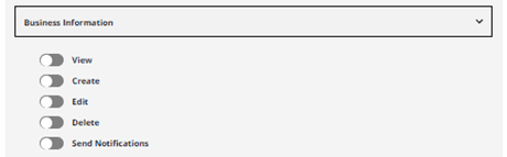
For Business Information Locations Permissions below are the buttons that can be specified:
- View – When turned on, it means this role can view this specific feature.
- Create – When turned on, this role can create in this specific feature.
- Edit – When turned on, this role can edit and modify in this specific feature.
- Delete – When turned on, this role can delete and modify in this specific feature.
- Send Notification – When turned on, this role can send notifications.
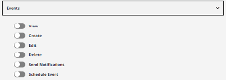
For Events Locations Permissions below are the buttons that can be specified:
- View – When turned on, it means this role can view this specific feature.
- Create – When turned on, this role can create in this specific feature.
- Edit – When turned on, this role can edit and modify in this specific feature.
- Delete – When turned on, this role can delete and modify in this specific feature.
- Send Notification – When turned on, this role can send notifications.
- Schedule Event – When turned on, this role can schedule an event.
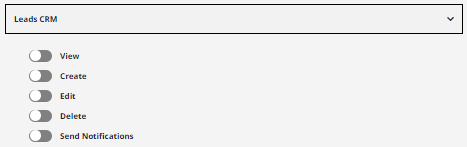
For Leads CRM Locations Permissions below are the buttons that can be specified:
- View – When turned on, it means this role can view this specific feature.
- Create – When turned on, this role can create in this specific feature.
- Edit – When turned on, this role can edit and modify in this specific feature.
- Delete – When turned on, this role can delete and modify in this specific feature.
- Send Notification – When turned on, this role can send notifications.
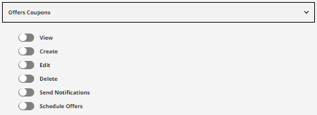
For Offers Coupons Locations Permissions below are the buttons that can be specified:
- View – When turned on, it means this role can view this specific feature.
- Create – When turned on, this role can create in this specific feature.
- Edit – When turned on, this role can edit and modify in this specific feature.
- Delete – When turned on, this role can delete and modify in this specific feature.
- Send Notification – When turned on, this role can send notifications.
- Schedule Offers – When turned on, this role can schedule an offer.
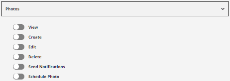
For Photos Locations Permissions below are the buttons that can be specified:
- View – When turned on, it means this role can view this specific feature.
- Create – When turned on, this role can create in this specific feature.
- Edit – When turned on, this role can edit and modify in this specific feature.
- Delete – When turned on, this role can delete and modify in this specific feature.
- Send Notification – When turned on, this role can send notifications.
- Schedule Photo – When turned on, this role can schedule a Photo.
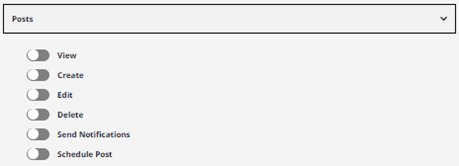
For Posts Locations Permissions below are the buttons that can be specified:
- View – When turned on, it means this role can view this specific feature.
- Create – When turned on, this role can create in this specific feature.
- Edit – When turned on, this role can edit and modify in this specific feature.
- Delete – When turned on, this role can delete and modify in this specific feature.
- Send Notification – When turned on, this role can send notifications.
- Schedule Post – When turned on, this role can schedule a Post.
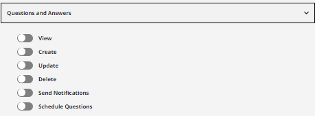
For Questions and Answers Locations Permissions below are the buttons that can be specified:
- View – When turned on, it means this role can view this specific feature.
- Create – When turned on, this role can create in this specific feature.
- Edit – When turned on, this role can edit and modify in this specific feature.
- Delete – When turned on, this role can delete and modify in this specific feature.
- Send Notification – When turned on, this role can send notifications.
- Schedule Questions – When turned on, this role can schedule a Question and Answer.
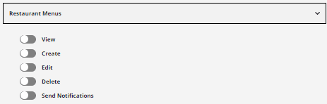
For Restaurant Menus Locations Permissions below are the buttons that can be specified:
- View – When turned on, it means this role can view this specific feature.
- Create – When turned on, this role can create in this specific feature.
- Edit – When turned on, this role can edit and modify in this specific feature.
- Delete – When turned on, this role can delete and modify in this specific feature.
- Send Notification – When turned on, this role can send notifications.
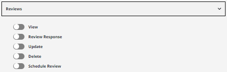
For Reviews Locations Permissions below are the buttons that can be specified:
- View – When turned on, it means this role can view this specific feature.
- Create – When turned on, this role can create in this specific feature.
- Edit – When turned on, this role can edit and modify in this specific feature.
- Delete – When turned on, this role can delete and modify in this specific feature.
- Schedule Review– When turned on, this role can schedule a Review.
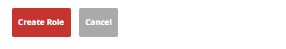
Roles and Permissions and Locations Permissions has been decided and customized, at the bottom of “Create Role” page are the following buttons:
Select the “Create Role” to save your selections or “Cancel” to discard entries.
As shown in the image above, enabling all the permissions can be done quickly by turning on the “Enable All” switch button. On the other hand, if only specific permissions will be assigned to this role, customizing each item of locations permissions is preferred.
It is also something to note that the buttons in each feature listed in Locations Permissions varies.
Roles List and Details
The Roles List displays all the Roles created.
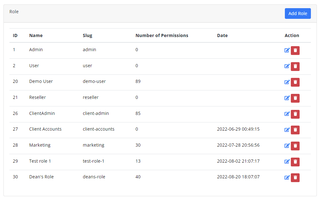
The roles list displays the following:
- ID – Identification number of the role
- Name – Specified Name for the role
- Slug – Simplified identifier of the role
- Number of Permissions – Number of permissions allowed or set for this role
- Date – The date and time when the role was created.
- Action – Shows all actionable items for the roles list
Roles Actionable Buttons
Edit Button
When the Edit button is selected it will load a page where the Roles Permissions and Locations Permissions can be updated. Basically, it will load back to the “Create Role” sections discussed prior to this part except for the buttons at the bottoms are as below:
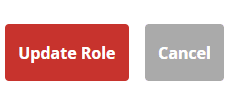
To apply the updates, select the “Update Role” button or the “Cancel” button to disregard the changes.
Delete Button
When the delete button is selected, a pop-up as shown in the image above will appear. This is to ensure that no role will be accidentally deleted at one click.
Permission Group
On the left side panel, select “Permission Group”. This will display all the Permission groups created or set by the admin user. On the upper right side of the page, is the “Add Group” button. The page would look like the example image below.
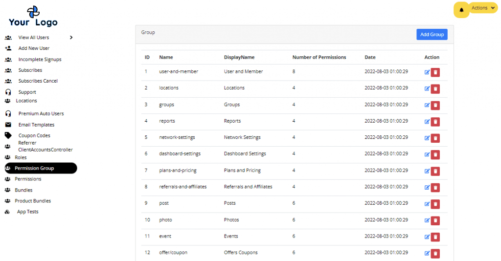
Permissions List and Details display the following information:
- ID
- Name – internal name
- Display Name – name that will show on the list
- Number of Permissions – Number of allowed permissions set in the permissions settings
- Date – Date Created/updated
- Action Button
Creating a Permission Group
To create a Permission Group, select the “Add Group” button on the upper right side of the main Permissions Group page. It will load the page “Create Permission Group Form”. See the example image below.
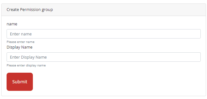
Fill in the Name and Display Name and click on the “Submit” button to save the new Permissions Group. It will then be on the main list of Permissions Group.
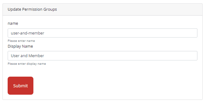
Edit Button
When the Edit Button is selected, it will load the update permission groups form. Once done updating the name and display name, select the “Submit” button to save changes.
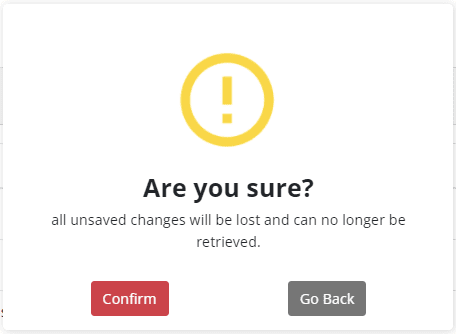
Delete Button
When the delete button is selected, a confirmation prompt like the example image below will display on the screen. This is to ensure that no permissions group will be deleted accidentally.

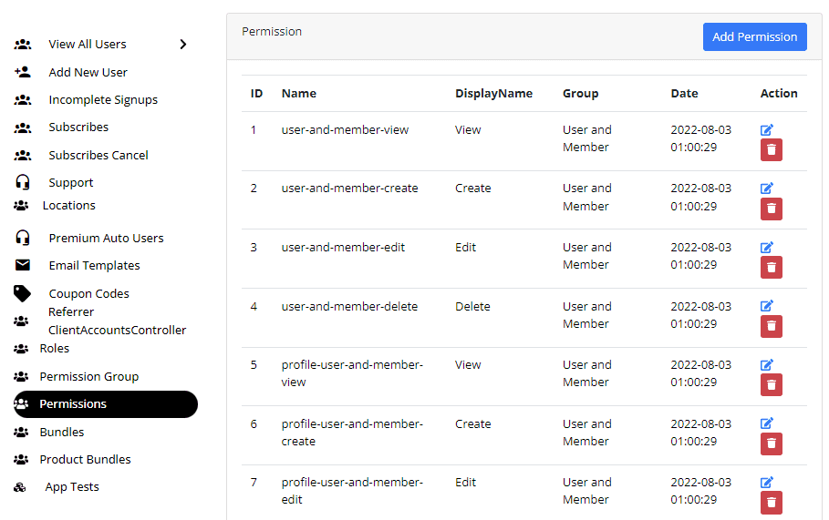
Permissions
On the left side panel, select “Permissions”. This will display all the Permission groups created or set by the admin user. On the upper right side of the page, is the “Add Permission” button. The page would look like the example image below.
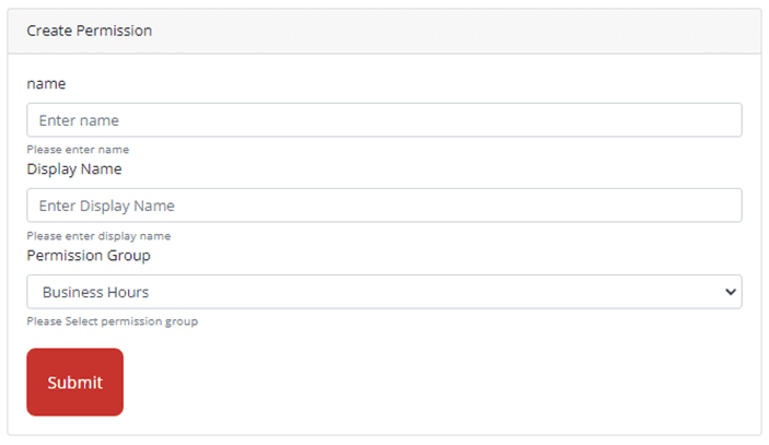
Adding Permissions
To add a Role, select the “Add Role” button at the top of the Roles Page. This will load the Create Role and Permissions and Locations Permissions Page where you can select the permissions and access of the new role. can be specified for a certain role.
To add a Role, select the “Add Role” button at the top of the Roles Page. This will load the Create Role and Permissions and Locations Permissions Page where you can select the permissions and access of the new role. can be specified for a certain role.
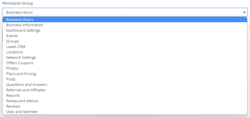
Once done, select “Submit” to save the entries.
Permissions List and Details
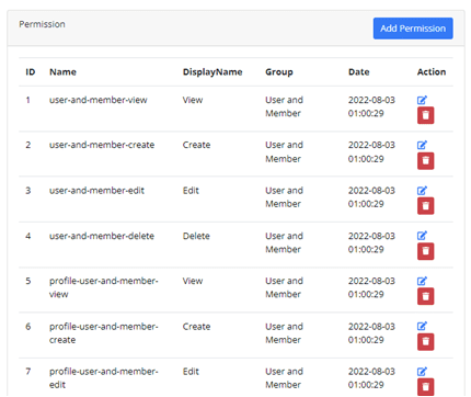
The Permissions list and details display the following information:
- ID
- Name
- Display Name
- Group
- Date
- Action
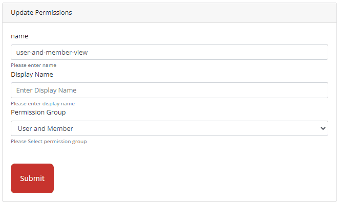
Edit Button
When the edit button is selected, it will load the Update Permissions page where you can update the Permissions Name, Display Name and Permission Group. Select the “Submit” button to save the changes.
Delete Button
When the delete button is selected, a confirmation prompt like the example image below will display on the screen. This is to ensure that no permissions will be deleted accidentally.
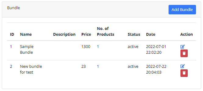
Bundles
On the left side panel, select “Bundles”. This will display all the Bundles created or set by the admin user. On the upper right side of the page, is the “Add Bundle” button. The page would look like the example image below.

The Bundle page will display the following information:
- ID
- Name
- Description
- Price
- No. of Products
- Status
- Date
- Action
Adding a Bundle
To add/create a bundle, click on the “Add Bundle” button on the upper right side of the page. It would load the “Create Bundle” form. See the example image below.
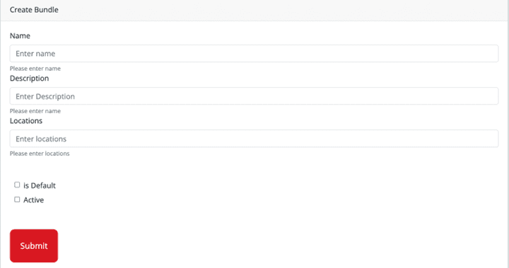
Fill in the form with the following information:
- Name – Input the name of the bundle
- Price – Input the price of the bundle
- Recurring – Choose from the dropdown if it will be a Monthly or Yearly plan
- Currency – Choose USD/preferred currency.
- Status – Choose Active or Inactive
- Client – From the dropdown, select the client this bundle will apply to
- Default Checkbox – Tick this if you want this bundle to be available for all clients.
- Products – Under products, it will display all the available products that you offer, choose the products that will be part of this bundle.
Once all fields have been filled, click on the “Submit” to save your entries. This Bundle will then reflect on the main Bundle Page list.
Bundle List and Details
The Bundle list and details display the following information:
- ID
- Name
- Description
- Price
- No. of Products
- Status
- Date
- Action
Bundle Actionable Buttons

Edit Button
When you select the Edit Button, it will load the “Update Bundle” form page. See image below for an example.
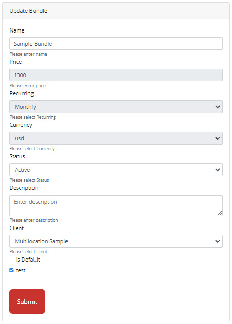
Update the form with the changes and click on the “Submit” button to save the input.
Delete Button
To add/create a bundle, click on the “Add Bundle” button on the upper right side of the page. It would load the “Create Bundle” form. See the example image below.
Product Bundles
On the left side panel, select “Product Bundles”. This will display all the Product Bundles created or set by the admin user. On the upper right side of the page, is the “Add Bundle Product” button. The page would look like the example image below.
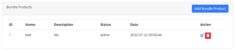
The Product Bundles page displays the following information:
- ID
- Name
- Description
- Status
- Date
- Action
Add Bundle Product
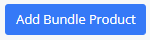
To Add a Bundle Product, click the “Add Bundle Product” at the upper right corner of the page.
It will load the Create Bundle Product form page. See example image below.
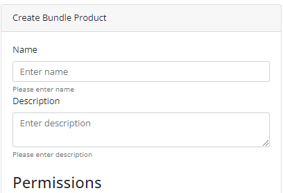
Input the “Name” and “Description” of your Product Bundle in their respective text box.
Under “Permissions”, assign the desired permissions to the following feature:
- Business Hours
- Business Information
- Dashboard Settings
- Events
- Groups
- Leads CRM
- Locations
- Network Changes
- Offers Coupons
- Photos
- Plans and Pricing
- Posts
- Questions and Answers
- Referrals and Affiliates
- Reports
- Restaurant Menus
- Reviews
- User and Member
Once you are done adding permissions, click on the “Submit” button at the bottom of the form.
Product Bundle List and Details

Product Bundle Actionable Buttons
Edit Button
When the edit button is clicked, it will load the update bundle product form page. Update its current selection and select “Submit” at the bottom of the page to save changes.
Delete Button
When the delete button is selected, a confirmation prompt like the example image below will display on the screen. This is to ensure that no Bundle Product will be deleted accidentally.
