Do you want your business to
Simply be found
by more
local customers?
Then you’ve found the right place!
Your Business Listed On Up To 300 Networks On Paid Plans


VOICE SEARCH
Register your business on Voice Search to show up on the top search results with Simply Be Found
LOCAL SEARCH
Access simple but powerful tools to connect your business with potential customers near you
MAPS
Through our platform, get found by your customers on Bing Maps, Google Maps, and Apple Maps
SOCIAL MEDIA
Update on Facebook and Google Business Profile anytime and anywhere using the platform
why voice search is important
to your business
More than 50% of your customers are using Alexa, Cortana, Bixby, Google Assistant, and Siri to look for products and services near them. We will make Voice Search registration and optimization simple for you so your business will be in the top voice search results.
it just takes
5 - 10 minutes
per day or
1 hour
every week
It’s super easy to do your own marketing using our simple marketing tools. No tech skills required! You can do your own marketing in just 5-10 minutes per day or an hour a week. That means you will have more time to focus on actually running your business.

Why should you invest in
LOCAL SEARCH
OPTIMIZATION?
Whether you’re selling a product or service, potential customers will always look for the best business provider that is near them. Simply Be Found allows you to easily market your business through simple but powerful marketing tools. You don’t need to spend so much time and money to rank higher in local searches and get the results that you want.

Is Your Business
Found on Maps?
Using our tools and platform, you can easily update your business information and make potential customers find your business on Google Maps, Apple Maps and Bing Maps where over 100 Million businesses are already listed. Take advantage of the power of Maps and dominate the market.

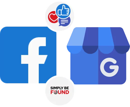
Manage
SOCIAL MEDIA
No marketing agency knows your business better than you. With our platform and set of marketing tools, it’s so simple to do business marketing all on your own. We make updating your Facebook and Google Business profiles simple. You can handle your social media all in one place without spending so much money and time.
Not Tech Savvy?
No Problem!
Members Doing Their Own Marketing Using Simply Be Found’s Marketing Tools Gained A 70% Increase In Online Visibility Of Their Business
Our entire platform and set of tools are built for the average business owner which is why even most of our members are not tech savvy, they still find our marketing tools simple to use.
what our members say
Simply Be Found was built to help small business owners who are just starting their journey by making marketing simple to do with the help of a simple platform, set of powerful marketing tools, and a dedicated and experienced support team, led by successful small business owners Dean & Rob, who sincerely want to see small businesses succeed.

We keep it simple.
Manage your business' online presence by accessing Simply Be Found's Tool in one place.
voice search
registration
Your business will be registered on the top voice search networks to help you get in front of more customers searching for the products and services you sell.
local seo
tools
Get more customers in your locality through these simple but powerful local SEO tools that will surely make your business stand out in your area.
marketing
coach
Get access to an experienced marketing coach who understands the real-life struggles of an entrepreneur, being small business owners themselves. They went through the same challenges, they came through, and they want to help your business succeed.
Co-FOUNDERS
DEAN AND ROB
Dean and Rob have established themselves as pioneers in business, voice search, local SEO, and digital marketing. Together with their team, your business will experience sustained growth.

Built By
Small Business Owners
For Small business owners
Our Platform and set of Tools were built by Dean and Rob, who are small business owners themselves, because they needed marketing tools for their other businesses to be found by more local customers.
This is why Simply Be Found is built for the non-tech savvy busy business owner and focuses on what matters most.
Built By Your
Feedback
Our entire platform is built by member feedback which makes us the go to marketing platform for small businesses because it has the right tools and focuses on being simple to use, affortable, and focuses on your bottom line.
Built For Small
business
Dean and Rob have 60+ years of small business experience. We understand the struggles, the challenges, and everything that comes with being a small business owner. We created Simply Be Found because we needed a solution that works for our other businesses, so we use the platform as a user and not just selling a solution.
Weekly Training
videos
We put out weekly training videos on the topics of how to use the platform, changes in the marketing and advertising world, and keeping you up to date on what you need to know.
1 in 5
chance
We are a small business and with small team but a powerful marketing platform. We believe in personal service and you have 1 in 5 chance of getting a co-founder when you have communication with us.
member
support
We are here to support you every step of the way. If you get lost, have a question or just need a little help we are a email away! Both Dean and Rob handle support along with our customer support team. We love to hear from our members and see them be sucessful.
community
facebook page
We have a community Facebook page where members can ask marketing questions, engage with each other, and be part of a community of local businesses who want to do their own marketing.
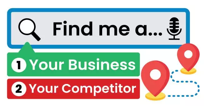
rank higher than your competition

We want your business to show up whenever your potential customers are looking for a product or service your business offers. Whether they are searching on Google, Bing, Google Maps, Apple Maps, or Bing Maps through their computer or smartphone, or via Voice Search through Alexa, Cortana, Bixby, Google Assistant, or Siri— the goal is for your business to be in the top search results.
They should see all your updated business information on there. It may sound daunting considering that you may have a lot of competitors in your area. This is where Simply Be Found can help you.
Simply Be Found will make being found by your customers and marketing your business simple for you. You can find everything you need in order to rank your business in search engines, maps, and voice search in the platform and you will have access to other features that will help propel your business to greater heights.
MORE TOOLS TO
super CHARGE YOUR BUSINESS
Most of our members report that they spend 5 to 10 minutes per day following the simple to-do list and seeing results that matter like more phone calls, more sales, and actual results.
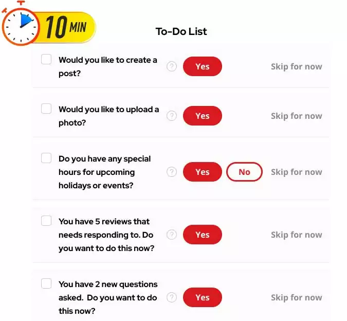
step by step
to-do list
This tool will help you stay on top of your daily business goals. We also have a recommended simple to-do list that only takes around 5 minutes to accomplish— and that is enough for you to see results for your business.
Reputation
Management
Manage your business reviews across the web in one place. You can monitor, showcase, and even reply using our platform.
Service
Area
This tool allows you to select up to 200 different targeted locations to help you target actual potential customers for your business.
Business
Information
Keep your information up to date anytime and anywhere right at the Simply Be Found platform.
Menu
Management
Does your business need a menu? You can create and manage it using this tool on our platform.
Create
Posts
Write posts and send them out to Facebook and Google Business Profile in just one place with Simply Be Found.
